

Nowadays, since practically everyone has access to a digital device, it seems that printing web pages is almost obsolete. However, there are some instances where you might still need to print a page, such as printing concert or travel tickets, printing a recipe for the list of ingredients to use as a shopping list, an invoice to keep for accounts or some route directions or timetables. But sometimes, printing a webpage can be a very unpleasant experience because of:
- tons of advertisements are included on the page and ink is wasted on unnecessary colored backgrounds and images
- the text can have different sizes, could be too small or too big
- columns can be too narrow or overflow page margins
- parts of the sections are chopped or not shown at all
But developers can make the printed web accessible by using the CSS print control and setting the responsiveness of the web page — the page size, format, layout or margins. A good method to include print styles is by using the CSS3 @media syntax, which is a reasonable technique for bringing a tailored style sheet (responsive web design) to desktops, laptops, tablets, and mobile phones. The @media rule specifies that some styles are only for printed documents or for screen readers (media type: print, screen or speech).
@media print {
   ...
}
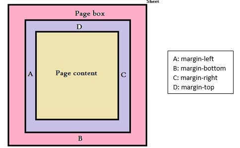
All CSS settings go between the opening and closing brackets. Next, we need to set the page properties, such as size, margins, borders and font size. The page box is a rectangular region that contains two embedded areas:
- The page area contains all the page containers.
- The margin area applies to the page box and might have the properties: margin-left, margin-right, margin-bottom, margin-top
A simple example of setting the left and right margins of the page:
@page  {
         margin-left: 1.2 cm;
         margin-right: 2.1 cm;
      }
Page Size
The size property specifies the size and orientation of a page box. The four values that can be used for page size are:
- auto — The page box will be set to the size and orientation of the target sheet.
- landscape — The page box is the same size as the target, but the wider sides are horizontal.
- portrait — The page box is the same size as the target, but the shorter sides are horizontal.
- length — Length values for the ‘size’ property create an absolute page box, and if only one is specified, then the page box will be a square, because both of them will take the same size
@media print
{
   @page
   {
    size: A4;
    size: portrait;
  }
}
The example below sets the page size to auto, meaning that the page box will be aligned to the target and the 5% of the margin represents the percentage from the page (if the page has 25 cm with 15 cm, then the margins will be 2,5 cm with 1,5cm).
@media print
{
@page {
    size: auto;
    margin: 10%;
  }
}
Another important step in printing a CSS page is using page breaks for setting exactly the point where the page will be interrupted. The three CSS attributes used for this are:
- page-break-before — adds a page break before a specified element.
- page-break-after — adds a page break after a specified element.
- page-break-inside — sets the case when a page-break should be avoided inside a specified element
The values that can be set for these three properties are auto represents the automatic page-break, always (not available for page-break-inside) places a break every time, avoid blocks the break, left and right (not available for page-break-inside). Values are used to continue pages that are formatted left or right, correspondingly, initial sets this property to its default value, inherit from its parent the value. some examples of using these properties are listed below:
//Using the page breaks on different sections of the webpage

@media print {

	footer {page-break-after: always;}

	a {page-break-inside: avoid;}

	h1, h2, h3, h4, h5 {page-break-before: always;}

	table, figure { page-break-inside: avoid;}
}
As you’ve probably experienced during printing a webpage, various unwanted elements arise on your printed page, so, it is an important step to get rid of them because is a waste of ink. For this we need to hide all the areas that are not important. Mainly, the most frequent portions to be eliminated are logo, page title, sidebar, header, footer, categories, comments and some buttons or images, etc.
//Hiding various unwanted sections of the webpage

#header-widgets, nav, .sidebar, .content-ads, .make-comment, .author-bio, .heading, .related-posts, #footer,
.site-title img, .logo
{
	display: none;
}
Sometimes, you may want to print multiple pages and perhaps you need to number them. You can do that in CSS using counters. The @page:first rule resets the counter for the first page to a value of 5, this mean that the counter will start from page 5, and so forth:
@page { counter-increment: page }
@page:first { counter-reset: page 4 }
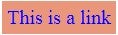
Highlighting Links
When trying to print content that contains links, you will notice that the links are not distinguished from the rest of the text, so links should be highlighted to get noticed. This can be done using the following properties:
// Displaying link color and link behaviour
a:link, a:visited {
    background-color: DarkSalmon ;
    border: none;
    color: #0000ff;
    padding: 5px 5px;
    text-align: center;
    text-decoration: none;
    font-size: 20px;
    text-align: center;
    display: inline-block;
}
Hiding videos and other iframes is another important step in creating a printing-friendly CSS page. The following code allows you to hide iframes, as well as videos completely.
//Making incorporated videos vanish, and eliminate the iframes whitespace to zero.
.entry iframe, {
    display: none;
    width: 0 !important;
    height: 0 !important;
    overflow: hidden !important;
    line-height: 0pt !important;
    white-space: nowrap;
}
.embed-youtube, .embed-responsive {
  position: absolute;
  height: 0;
  overflow: hidden;
}
Sometimes, it can be very helpful to add messages before and after the main printed content. You can list a copyright message, or a specific message addressed to the reader, and you need to find the perfect place to put it in your code:
//Adding a specific message before and after the content
.entry:after {
content: "\ All Rights Reserved. (c) November 2019";
color: #FF2446 !important;
font-size: 2em;
padding-top: 20px;
}

#header:before {
content: "\ Thank you for printing our article!";
color: #dcba00 !important;
font-size: 2 em;
padding-top: 20px;
text-align: center !important;
}