

Back in the late twentieth century, the de facto tool for arranging web content in rows and columns was not CSS at all, but the table! This worked very well for years, until responsiveness became a primary concern. Then in the 2010’s, everything changed when the CSS flexbox was introduced as a W3C Candidate Recommendation. From there, it was quickly adopted by the major browsers. Developers, on the other hand, were a little slower to jump on the flexbox bandwagon, the reason being that it was intimidating to the uninitialed. As a senior developer, I’ve had to guide a few novice coders through the basics of flexbox’s many properties and attributes. Since it’s predominantly used to define grid layouts, I thought that I’d summarize the finer points of doing so in this tutorial.
Layout 1: Two Columns
The most basic application of the flexbox is to layout page content in either two columns or rows, so we’ll begin by creating two columns: one that takes 40% of the available width and another that fills the remaining 60%.
The HTML markup shown below will be the basis for all layouts, from most basic to complex. The beauty of using flexbox – and indeed, CSS in general – is that the same HTML structure may be presented using a variety of layouts:
<div class='wrapper'>
  <div class='row'>
    <div class='column column1'>
      <div class='content'>
        Column One Content
      </div>
    </div>
    <div class='column column2'>
      <div class='content'>
        Column Two Content
      </div>
    </div>
  </div>
</div>
Looking at the SCSS below, you can see that we don’t need a lot of styling to get the job done. In fact, the column1 and column2 rules are only required to set the width and background colors. If these were the same for both columns, we could dispense with those rules.
.row {
  display: flex;
  flex-direction: row; //default
  min-height: 100px;

  .content {
    height: 100%;
    padding: 5px;
  }

  .column1 {
    flex-basis: 40%;

    .content {
      background-color: #b0b0b0;
    }
  }

  .column2 {
    flex-basis: 60%;

    .content {
      background-color: #c9c9c9;
    }
  }
}
Of all the rules above, the .row is responsible for left to right layout. That’s because the row is the parent container of the column elements.
Let’s take a moment to go over what each attribute does:
- display: flex; – Defines a flex container and enables a flex context for all its direct children.
- flex-direction: row; – Establishes the main-axis. This will lay out flex items either in horizontal rows (default) or vertical columns. A value of row arranges elements just like text, i.e., left to right in ltr and right to left in rtl, while column arranges elements from top to bottom.
- min-height: 100px; – This property has nothing to do with the flex layout, but sets the minimum row height in cases where there is insufficient content to achieve it.
Here is the resulting layout in the browser with some sample text:

Layout 2: Three Columns of Equal Width
A flexbox layout is just as easily applied to elements of equal width. To demonstrate, we’ll add a column to the existing HTML content:
<div class='wrapper'>
  <div class='row'>
    <div class='column column1'>
      <div class='content'>
        Column One Content
      </div>
    </div>
    <div class='column column2'>
      <div class='content'>
        Column Two Content
      </div>
    </div>
  </div>
  <div class='column column3'>
      <div class='content'>
        Column Three Content
      </div>
    </div>
  </div>
</div>
While the flex-basis attribute is no longer required, we’ll need to add a rule for the .column class. It will set two attributes: display and flex. Setting the display to “flex” defines a flex container, as we did for the .row class. The flex is actually shorthand for three attributes, namely flex-grow, flex-shrink and flex-basis. We’ve already covered flex-basis. Flex-grow and flex-shrink define the ability for a flex item to grow or shrink if necessary. Both accept a unitless value that serves as a proportion that dictates what amount of the available space inside the flex container the item should take up. When all items have a flex-grow or flex-shrink set to 1, the remaining space in the container will be distributed equally to all children. Higher numbers will cause the remaining space to take up twice (flex-grow) or half (flex-shrink) as much space as the others. Both the flex-shrink and flex-basis values are optional, so flex: 1; tells the browser to allocate equal space to each element:
.column {
    display: flex;
    flex: 1;
  }

  .column1 > .content {
    background-color: #b0b0b0;
  }

  .column2 > .content {
    background-color: #c9c9c9;
  }

  .column3 > .content {
    background-color: #dedede;
  }
}
As before, feel free to ignore the other three rules, as they are not related to the layout.
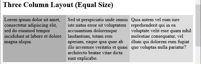
Here is a screenshot of the three column layout in the browser:
Layout 3: Two Rows
Believe it or not, most of the hard work has already been done. The biggest change associated with adding another row will be seen in the HTML, which now contains similar markup for both rows:
<div class='wrapper'>
  <div class='row'>
    <div class='column column1'>
      <div class='content'>
        Row One, Column One Content
      </div>
    </div>
    <div class='column column2'>
      <div class='content'>
        Row One, Column Two Content
      </div>
    </div>
  </div>
  <div class='column column3'>
      <div class='content'>
        Row One, Column Three Content
      </div>
    </div>
  </div>
  <div class='row'>
    <div class='column column1'>
      <div class='content'>
        Row Two, Column One Content
      </div>
    </div>
    <div class='column column2'>
      <div class='content'>
        Row Two, Column Two Content
      </div>
    </div>
  </div>
  <div class='column column3'>
      <div class='content'>
        Row Two, Column Three Content
      </div>
    </div>
  </div>
</div>
The only change that we need to make to the CSS is add the flex-direction attribute to our .column rule. That will arrange our .column elements as columns:
.column {
  display: flex;
  flex-direction: column;
  flex: 1;
}
You can always include the flex-direction attribute even if you only have one row, as it only comes into play when there are multiple elements to arrange.
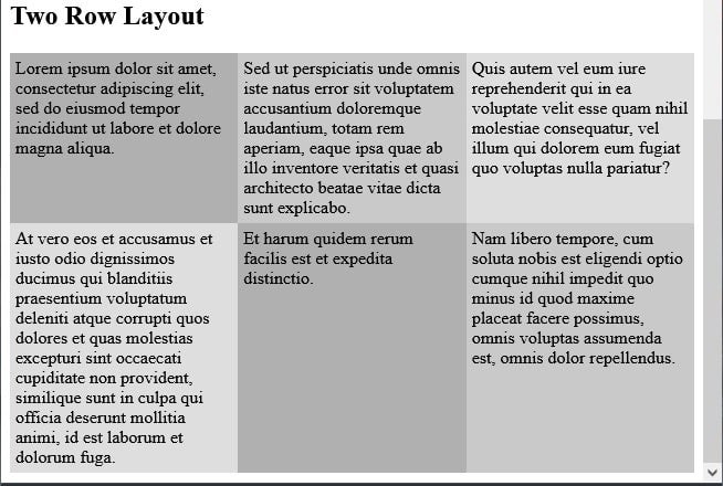
Here’s what that looks like on the demo page:
The demo that shows each layout in action is up on codepen.io. Feel free to play with the browser width and see what happens.
Conclusion
In this tutorial, we learned how to create grid layouts using the mighty CSS flexbox. Don’t let its wide array of attributes and values dissuade you from becoming a flexbox guru, especially now that you’ve taken your first steps!