

Build a Web Form with HTML – Part 7
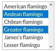
In this series on Web Forms, we’ve been learning how to create and style common form controls. In the last installment, we learned how to customize the standard <select> element. As described there, selects come in a second flavor, which allows a user to select more than one option. It appears as a list, without a drop-down component:
This installment will cover the creation and customizing of multi-select lists as well as how to disable <select> elements.
Before we move on, however, you may want to refresh your memory by revisiting the previous articles in this series:
- How to Build Web Forms in HTML
- Building Web Forms in HTML: Part 2
- Styling Form Controls with CSS – Part 3
- CSS for Labels, Buttons, and Form Interactions – Part 4
- Styling Radio Buttons and Checkboxes in HTML Forms – Part 5
- Styling the Standard Select with CSS and HTML – Part 6
Creating a Multiple Select List in CSS
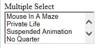
From an HTML perspective, all you have to do to turn a standard <select> element into on that allows a user to select more than one option is to add the multiple attribute. For customization purposes, we’ll wrap the <select> within a <div> that includes a class called select-multiple:
<label for="multi-select">Multiple Select</label>
<div class="select select-multiple">
<select id="multi-select" multiple>
<option value="MIaM">Mouse In A Maze</option>
<option value="PL">Private Life</option>
<option value="SA">Suspended Animation</option>
<option value="NQ">No Quarter</option>
<option value="11:11">11:11 Ultimate Edition</option>
<option value="UV">Ultraviolence</
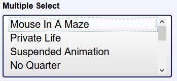
Here is our song list with no styling whatsoever:
General Select Styling in CSS
All of the styles that we employed previously to customize the standard <select> element are still applicable here. For reference, here are those styles using Sassy CSS (SCSS):
:root {
  --select-border: #393939;
  --select-focus: #101484;
  --select-arrow: var(--select-border);
}

select {
  // styles reset, including removing the default dropdown arrow
  appearance: none;
  -webkit-appearance: none;
  -moz-appearance: none;
  background-color: transparent;
  border: none;
  padding: 0 1em 0 0;
  margin: 0;
  width: 100%;
  font-family: inherit;
  font-size: inherit;
  cursor: inherit;
  line-height: inherit;

  // Stack above custom arrow
  z-index: 1;

  // Remove focus outline
  outline: none;
}

.select {
  display: grid;
  grid-template-areas: "select";
  align-items: center;
  position: relative;

  select,
  &::after {
    grid-area: select;
  }

  min-width: 15ch;
  max-width: 30ch;
  border: 1px solid var(--select-border);
  border-radius: 0.25em;
  padding: 0.25em 0.5em;
  font-size: 1.25rem;
  cursor: pointer;
  line-height: 1.1;

  // Optional styles
  // remove for transparency
  background: linear-gradient(to bottom, #ffffff 0%, #e5e5e5 100%);

  // Custom arrow
  &::after {
    content: "";
    justify-self: end;
    width: 0.8em;
    height: 0.5em;
    background-color: var(--select-arrow);
    clip-path: polygon(100% 0%, 0 0%, 50% 100%);
  }
}
We can see their effects on a multi-select below.
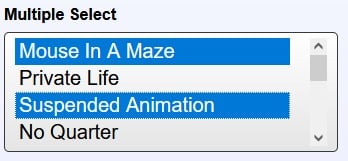
Overall it looks quite good. The only issue is that the selected options don’t extend all the way to the vertical scroll bar.
So, let’s fix that now by setting the padding-right in a new rule that specifically targets multiple selects:
select[multiple] {
  padding-right: 0;
  height: 7rem;
}
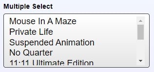
The height determines how many items are visible in the list at any one time without scrolling. Safari will not show partial options, while Firefox, Chrome and Microsoft Edge do. You can see a partial option in Edge here:
Setting the Focus Border
Having removed the default <select> element using the CSS appearance attribute, we now have to set the focus border ourselves. As we did last time, we’ll employ a CSS variable for the color:
select:focus + .focus {
  position: absolute;
  top: -1px;
  left: -1px;
  right: -1px;
  bottom: -1px;
  border: 2px solid var(--select-focus);
  border-radius: inherit;
}
Now, tabbing to the multi-select list shows this:
There is also a border around the first option (not added by us) so that the user can navigate through the items using the UP and DOWN arrow keys.
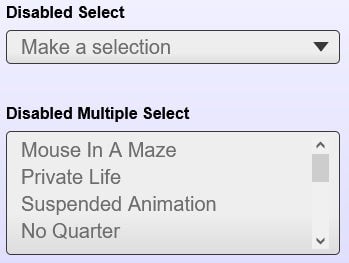
Disabling Selects
The handling of disabled selects must also fall upon our shoulders. To do that, we’ll add the select-disabled class to the <div> wrapper as well as the disabled attribute on the <select> itself. For completeness, both the multiple and standard <select> are shown below:
<!-- Multi-select -->
<div class="select select-disabled select-multiple">
  <select id="multi-select-disabled" multiple disabled>
    <!-- options -->
  </select>
</div>

<!-- Standard Select -->
<div class="select select-disabled">
  <select id="standard-select-disabled" disabled>
    <!-- options -->
  </select>
</div>
Using our .select-disabled class, we can alter the select’s appearance to give it that “greyed out” look:
.select-disabled {
  cursor: not-allowed;
  background-color: #eee;
  background-image: linear-gradient(to top, #ddd, #eee 33%);
}
When one hovers the cursor over the disabled select, the it turns into a “not-allowed” cursor, which is a red circle with a line through it, sort of like the Ghost Busters logo.
Behind the scenes, the disabled attribute that we added to the <select> tag makes the control unresponsive to all user interactions.
You’ll find the demo for this tutorial on codepen.io.
Conclusion
In this installment of the Build a Web Form with HTML series, we went through the process of creating and customizing a multi-select list and learned how to disable <select> elements. In the next and final article of the series we’ll change gears by integrating JavaScript into an HTML form to make it more interactive.