


Media queries are CSS modules that give specific instructions regarding the layout of web pages.
In this article, we look at 10 of them.
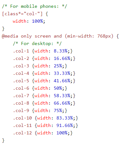
1. When setting up media queries, it is essential to design for mobile first.
By doing so, the page(s) will display faster on smaller devices.
Here is an example of the code.
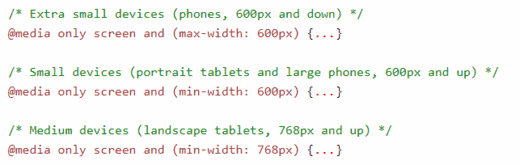
2. When setting up your layouts, one must consider the different screens and devices
Each has its own style of heights and widths, so setting breakpoints for each device is difficult. One way to deal with this problem is to set approximate breakpoints and to only cover a limited number of devices.
Here is an example of the code you would use:
3. Another way of dealing with breakpoints
There are no solid rules when it comes to breakpoints. There are many opinions and you must decide what works for you and/or your clients. One way to deal with the issue is to begin with a mobile layout, then expand the layout until it is obvious the design no longer working. This would be a good time to insert a breakpoint.
4. Consider creating effects depending on the orientation of the device
For example, if the device is rotated to landscape mode, it would trigger an effect.
@media only screen and (orientation: landscape) {
    body {
        background-color: saddlebrown;
    }
5. Fonts are extremely important, especially on mobile devices
You want to choose a font which is easy to read at different resolutions. It is also essential to avoid fancy fonts. The other issue is contrast. Not enough and your text will be hard to read. Here is an example of how you would set up a media query for fonts.
/* If screen size is 501px plus, set the font-size of <div> to 90px */
@media only screen and (min-width: 501px) {
  div.example {
    font-size: 90px;
  }
}

/* If screen size is 500px or less, set the font-size of <div> to 35px */
@media only screen and (max-width: 500px) {
  div.example {
    font-size: 35px;
  }
6. Sizing Images
There are many opinions on this topic. Some designers prefer to use one image and resize it use CSS. That is a dangerous practice because if you design an image for mobile and scale it to work on a desktop, it will eventually pixelate, or fall apart. A better practice is to use different image sizes, such as small, medium, and large, depending on the device. A small image would be perfect for mobile and, optimized correctly, would load much faster than an all-purpose image. The other thing to realize is if an image is scaled more than 20%, it will begin to become pixelated, so you need to take that into consideration as you build your layouts.
7. Hiding Elements when the screen size changes
Hiding elements is a good practice if they don’t look good when reduced, such as on a mobile device. Here is some code you could use:
@media screen and (max-width: 400px) {
  div.example {
    display: none;
  }
}
8. Navigation Menus are important
Below is some code which will display a navigational menu horizontally on large screens and vertically on small screens.
@media screen (max-width: 601px) {
    .topnav a {
        float: none;
        width: 100%;
    }
}
9. Test your code
Make sure the code you use doesn’t cause conflicts. That could spell trouble down the line. And if you cannot test all the permutations of your code, check into some beta testers who can help you out and make sure what you have done doesn’t have any serious glitches. Few things are more embarrassing than having to fix a major problem after the fact.
10. Don’t go overboard
While media queries are important, you want to keep your layout as simple as possible. If you keep things simple, there will be less ongoing maintenance to keep your site fresh and clean.
About the Author
Nathan Segal has been working as a freelance writer for 18 years. In that time he has published more than 1,000 articles and has written 9 books. You can learn more about him at https://NathanSegal.org.